LEARNING TARGETS:
» I understand » I understand the responsibilities and ethics associated with publishing to the internet
Using the transform, liquefy filter and some shading, were going to effectively dress up a rhino in zebra fur.
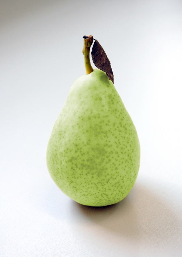
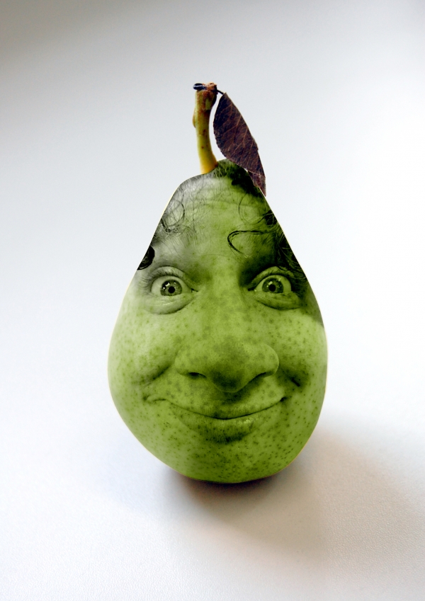
Source Images
In this tutorial, we're going to combine two animals:
Old Version
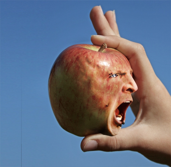
And This:
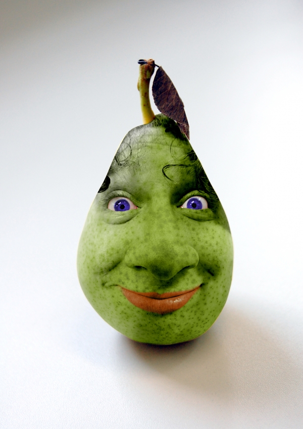
And should look something like this:
First and most important is to find the proper source images. I chose these 2 since the angles and stances are very similar.
Since I liked the high contrast color of the zebra, I decided to use the actual fur and "mold" it over the rhino's body. So with that said, I extracted the zebra from its background and pasted it into the rhino file on a new layer.
NOTE: It's a good idea to use a hi-res image because when you're stretching pixels, a low resolution file is going to lose its realism.
*New Step: CUT OUT ZEBRA
Cut out the zebra and then paste it on top of the rhino image.
Using the warp tool, transform the zebra to best fit the zebra skin over the rhino. It will same time and produce a better looking rhino.
Liquify is your friend
Since my goal is to cover the rhino's body completely with the zebra, it is best to use the liquefy tool next.
 The layers can be a bit tricky. First make sure your layers are labeled, rhino & zebra. Select the layer you want to liquefy and choose Filters > Liquefy First we want to make sure it is set up right, in the lower right hand corner, go to View Options Change the following:
Use: Rhino
Mode: Behind
It is important to become familiar with this, because it tis tricky.
I start with a large brush and as I progress make my brush smaller for the details.
You need to have quite a bit of patience with the Liquefy filter to get the best results. I'm going to assume that you have some experience with this filter so I'm gonna get to the point.
Under the Show Backdrop settings set Use: to Layer 2 (the rhino layer) and then the Mode: to Behind.
1. Decreased the the Zebra's opacity to about 70% This will help you get better results matching up the two animals.
2. Start off by using a fairly large brush (about 1/3 the size of the animal) and with small strokes, pull the Zebra's main torso to match the rhino. Try to avoid making long pulls because you won't get desired results. Using the large brush, I basically stretched out the top, buttocks, belly, chest and then I repositioned the head.
3. Once you're happy with those results, you're then going to fine tune the rest of the body using smaller sized brushes. For the Zebra's head, I used small, even strokes to match the shape of the underlying Rhino.
Since the legs are so close together, I had to use the Liquefy filter's built in mask tool to protect one leg as I shaped the adjacent one.
Once you have matched the entire silhouette of the Rhino, save your adjustments and get ready for the next step.
Okay, the shaping looks ok but our new animal friend is looking a bit flat. We're going to add more depth to this image by adding shadows. I'm not going to be using any blending modes because I want to keep as much detail and contrast as I can -- so with that said:
Make a new layer atop the Zebra and select a soft brush set a 15-30% opacity.
TIP: Hold down the OPTION key and move the cursor in between new blank layer and the Zebra layer. When the cursor changes it's shape, click the mouse button and you have now effectively made a clipping mask. All your shadows will now be contained inside the zebra.
To get the best shading, I occasionally turned the visibility of the Zebra layer on and off used the Rhino background as a reference as to where to add new shadows.
Yeah, that looks better.
Now for the head:
If you look at the original rhino picture, you'll see that the head has a distinct shape under the horns. It looks like its beefed up.
Okay, add a new layer
Using a smaller, soft brush at around 30% opacity, draw out the distinct lines under the horns (again, use the rhino background image as a reference). With some patience you should get the desired results.
If you find that the shading is a bit too dark, you could adjust the layer opacity of your shadows.
Good Luck and I hope this helps. Here is what it should look like again.
This was taken from Worth1000.com - Our firewall blocks Worth1000.com for the students.


